WHICH MEDIUM WAS YOUR FAVORITE?
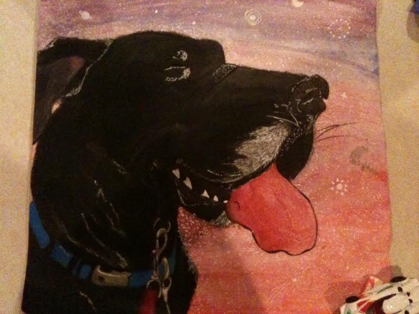
My favorite medium to use throught this drawing class is primsa color colored pencils. This was my favorite medium because it has a large range of things you can do with it. From fine detail to abstract blobage primsa color can do it. Prisma color has taught me to see the immense amount of colors that actually exist in everyday objects. This definitly showed itself when i was doing my perspective project because i had to use around nine or ten individual colors to shade just one area, for example using orange, purple, blue, black, and yellow to draw a black horse. This can also be difficult because if i used to many colors the horse i was trying to draw would have ended up looking like some kind of mystical rainbow horse rather than a black percheron mare. The skills i learned with primsa colors i also could apply to different mediums such as chalk pastels. Personally i hate chalk pastel but after learning some of prisma color i was able to lay down the four or five pastels i had and make five hundred colors and shades if i needed to. One thing i do not like about primsa color is the difficulty involved with layering the colors properly because once you put primsa color is put on to paper there is almost no way to cover or get rid of it. But despite that i look forward to using and growing with prisma colored pencils in the future.
MINI LESSON
The most beneficial mini lesson for me was where we learned portraiture. I learned alot here not only because i usually dont draw people but also because i have never even heard of the techniques we were taught. I thought it was awesome because i never knew that you could use the length of your subjects eye to determine the length in between where the other facial features are.
This mini lesson aloud me to have great success in my portrait project because i was able to convey emotion in my subjects face without them looking like they got hit with a frying pan. The second most beneficial mini lesson was the shading of shapes with charcoal. This lesson taught me alot because i never thought that you could obtain very much value with such a dark medium. I also learned that you should never smudge charcoal because it eliminates the entire idea of how to use charcoal because smudging with just give u a grey shapeless blob. This mini lesson helped me to create my still life project of the horse skull because of the understanding i had gained about highlights and low lights of shapes and their shadows.
This mini lesson aloud me to have great success in my portrait project because i was able to convey emotion in my subjects face without them looking like they got hit with a frying pan. The second most beneficial mini lesson was the shading of shapes with charcoal. This lesson taught me alot because i never thought that you could obtain very much value with such a dark medium. I also learned that you should never smudge charcoal because it eliminates the entire idea of how to use charcoal because smudging with just give u a grey shapeless blob. This mini lesson helped me to create my still life project of the horse skull because of the understanding i had gained about highlights and low lights of shapes and their shadows.
How have you grown?
This is my progression drawing of a paper bag getting crumpled.
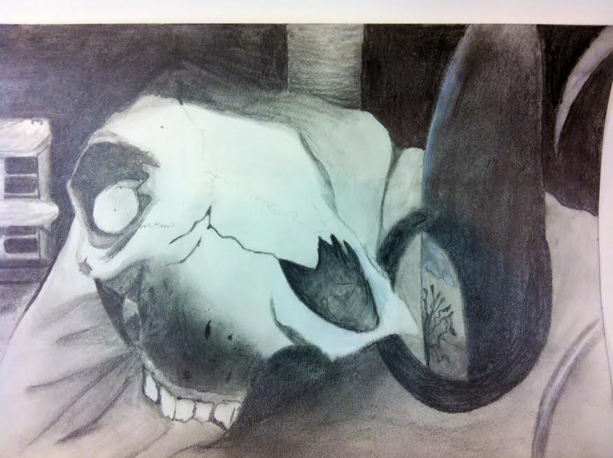
These two projects show a lot of growth through out this semester because although they are not very far apart in time from each other i feel like they are on totally different ends of the spectrum. Both of these pieces were done with graphite pencil and ink. I have shown lots of growth in the application of this because as you can see on my first progression drawing the values have little range and were sloppily placed within the space. But on my second drawing the values were laid out carefully and i think this shows a large amount of control with color and creating many different shades from the two colors that were available to me. The techniques of these two are also very different, the first piece i used scumbling and smudging to create depth. But on the second drawing i used lots of control and spent a lot of time carefully placing each stroke of the pencil. My artistic vision also has grown because i learned how to find interesting angles in what i am drawing. The first piece was at a very boring front-side angle where the bag just sat there crumpled up. But in the second drawing i chose an interesting angle to draw the skull from that used foreshortening and the objects in relation to each other to create lots of depth from the front to back. My creativity has grown as well because of the way i chose to draw my drawings once again in the right perspective and picking one object out of the many choices i had to pick from. In the first drawing i chose a paper bag which is very boring but in the second drawing i chose a skull and bottle because they had very different textures and wanted to draw them together.
Which project was i least successfull?
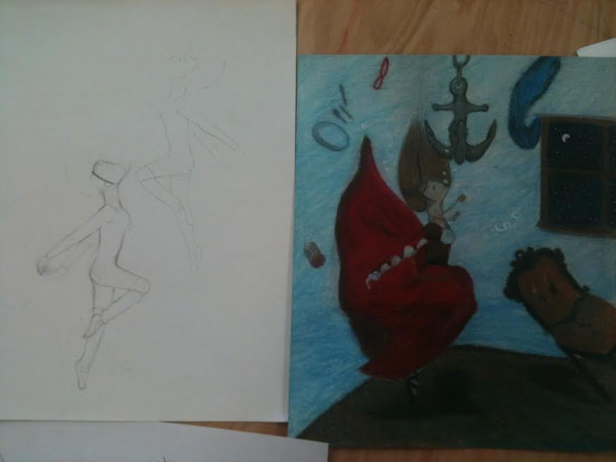
My least successful project by far was my opacity project. When i began this project i had the idea that a girl would be under water with alot of opacity in her dress and the water itself but it didnt turn out quite that way. In terms of ideas i thought that this project was a great idea because of the background and story to go along with it. So my intentions for the water were to make it look like water obviously but instead it came out looking like some kind of pastel jello mess. This happened because i did not layer the colors properly because i started too dark and then went to light and that caused the colors to be unable to blend. Along with that the dress in the picture should not have been so solid looking. The lines for the dress i thought looked great but the color added to it gave it a thick blocky effect. But i have learned from this project about using primsa colors and how to properly layer for an aquatic effect. If i were to do this project again i would have done it much larger, put greater detail into it overall. and used water color paint for the actual water part of it.
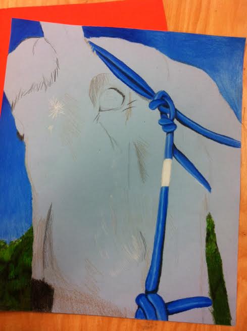
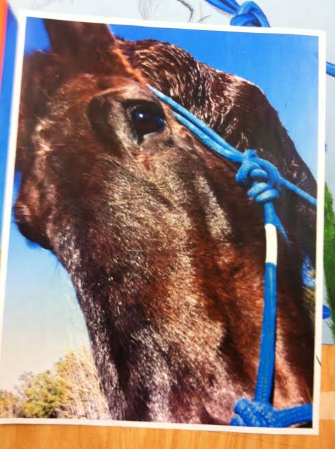
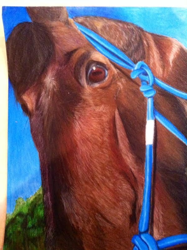
Which project was i most successful
My most successful project i believe is my perspective project. This project was both extremely challenging for me but also very enjoyable. To create this i started with taking pictures of a horse named Lilly, she is a Percheron cross and stands at 17.5 hands high. I took this picture of her right after i gave her a bath so the highlights on her fur really stood out. I started this project out with choosing a light blue colored paper and getting an overall layout of how i wanted it to look. Then slowly but surely i added light values with the colored pencil and moved on to dark values. This was my first time ever using Primsa colored pencils and I'm really happy with the result. I do wish that i could have made her coat highlights brighter but i had trouble getting anything even the gel pen to show up on all the layers i had put on. I also wish i could have gone darker on some places like in the actual coloring in the eye. But still i fell this is my most successful project due to the amount of growth that i had thorough the whole process not only in perspective, but also in realism and color.