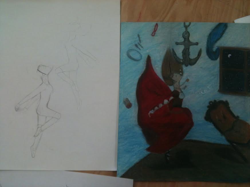
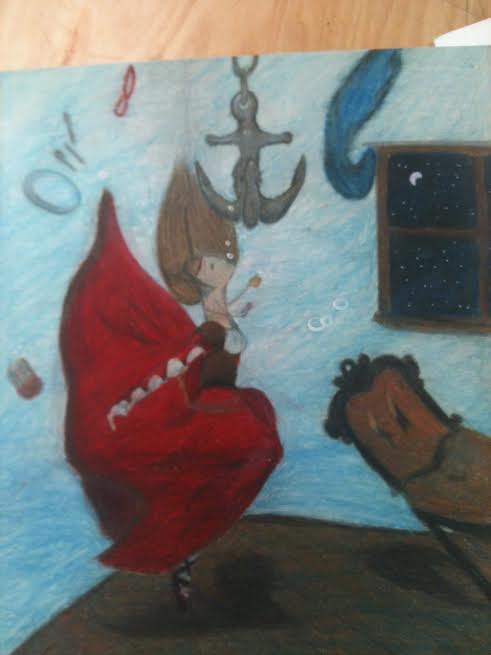
This is my opacity project of which im not to crazily pleased about but i feel as though it came out ok. The idea of this piece is that the girl is in her own world within her mind and her feelings are as though shes drowning. Its not a physical drowning like in water but more of drowning inside of her thoughts and feeling trapped and helpless in a way. While that may seem kinda dark i feel its a good expression of feelings and a good representation of the idea. The girl is wearing a medieval dress to represent the fact that shes been here a long with the inability to escape.
So if you cant already tell, i suck at drawing cars, but this is a ford f250 king ranch. This is my favorite car because when i get older i want to have many animals on a farm and i would need a truck like this thats meant for farm work. I decided to try this homework in pen to try to make it more challenging as well as getting myself used to drawing with ink and not erasing so much. the propotions on this car didnt come out so well but otherwise im proud of it because i have only ever drawn one other car. If this were an asignment or a project i would have spent more time on it and i would be capable of making it look better.
For this homework we were instructed to sketch a few of our pets from life. the first picture of the pug in the bottom left, her name is actually pug and i drew her while my friend held her in her lap. the bottom right picture is my friends pet duck named willard. and although it looks like someone is strangling the duck i there only supporting his head to keep him calm. the top middle picture is of my hamster named nugget. he fell asleep in that pose on the side of his glass tank so i just had to draw it. and the very last picture is of my horse lilly, i couldnt draw her from life so i just did a quick sketch of her to add for the fun.
i LOVED this project. i absolutely love color and i am so glad that i am learning how to apply it properly. For this project we took pictures of eggs in dramatic lighting and apply color to them. the eggs i took pictures of were white and so there was some difficulty applying the color properly. i chose to smooth the chalk pastels because the surface of the eggs are smooth and i thought the value was better applied that way. i chose to use complementary colors to shade my eggs because i think the contrast is beautiful and really makes each other pop.
|
AuthorWrite something about yourself. No need to be fancy, just an overview. CategoriesArchives
May 2015
|